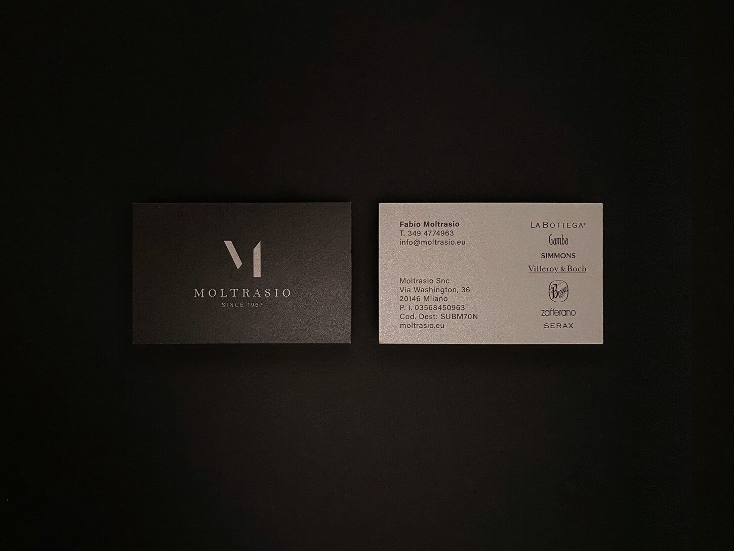
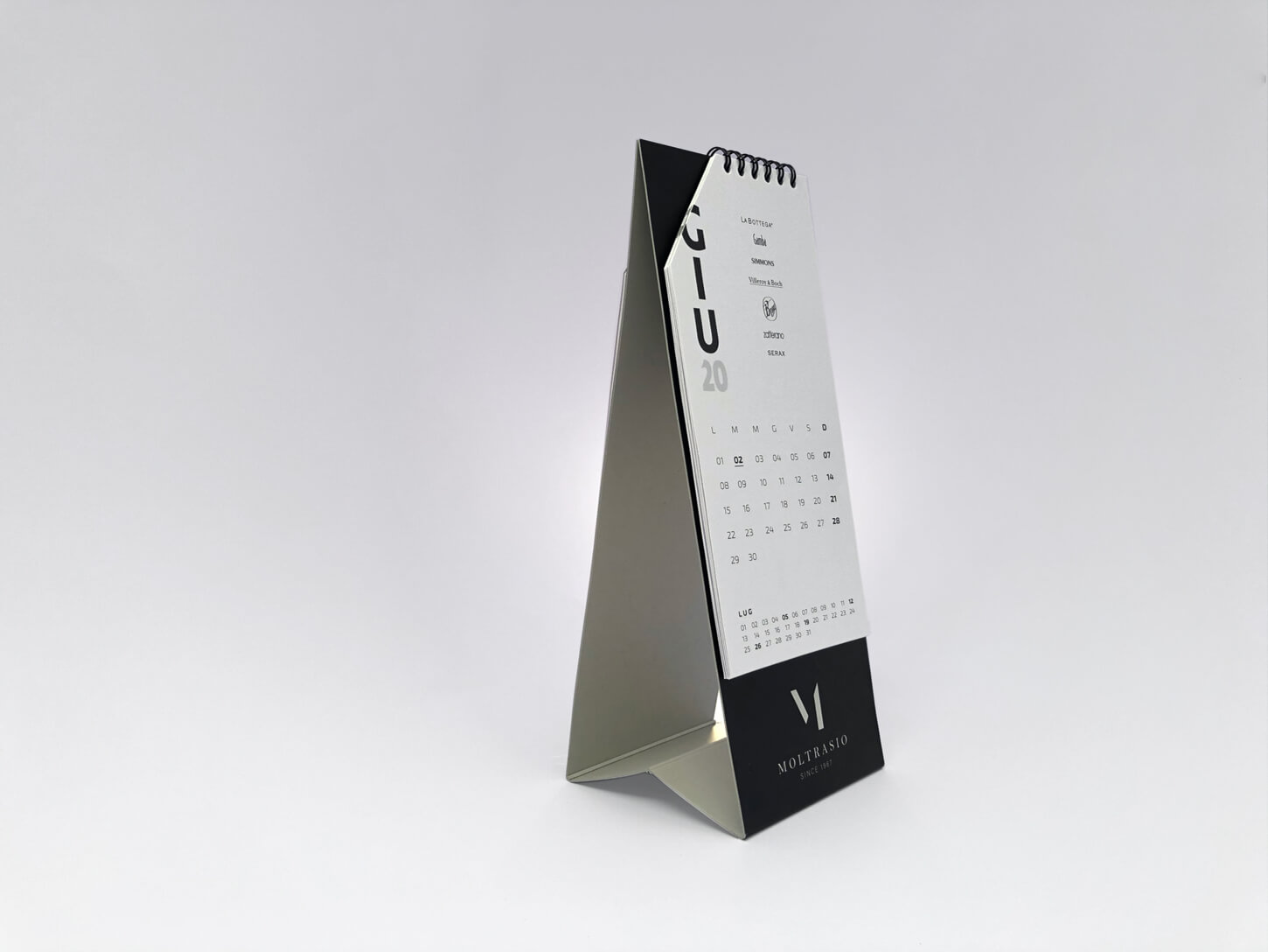
A complete rebranding project (ranging from the logo to the corporate identity to the website’s redesign) for Moltrasio, a real landmark in the hospitality industry since 1967.

Moltrasio boasts collaborations with the most outstanding hotels, restaurants and patisseries around the world by providing them with deluxe supplies, furthermore, offering curated consultancy to those luxury facilities aiming to express a refined identity and an avant-garde approach to hospitality.
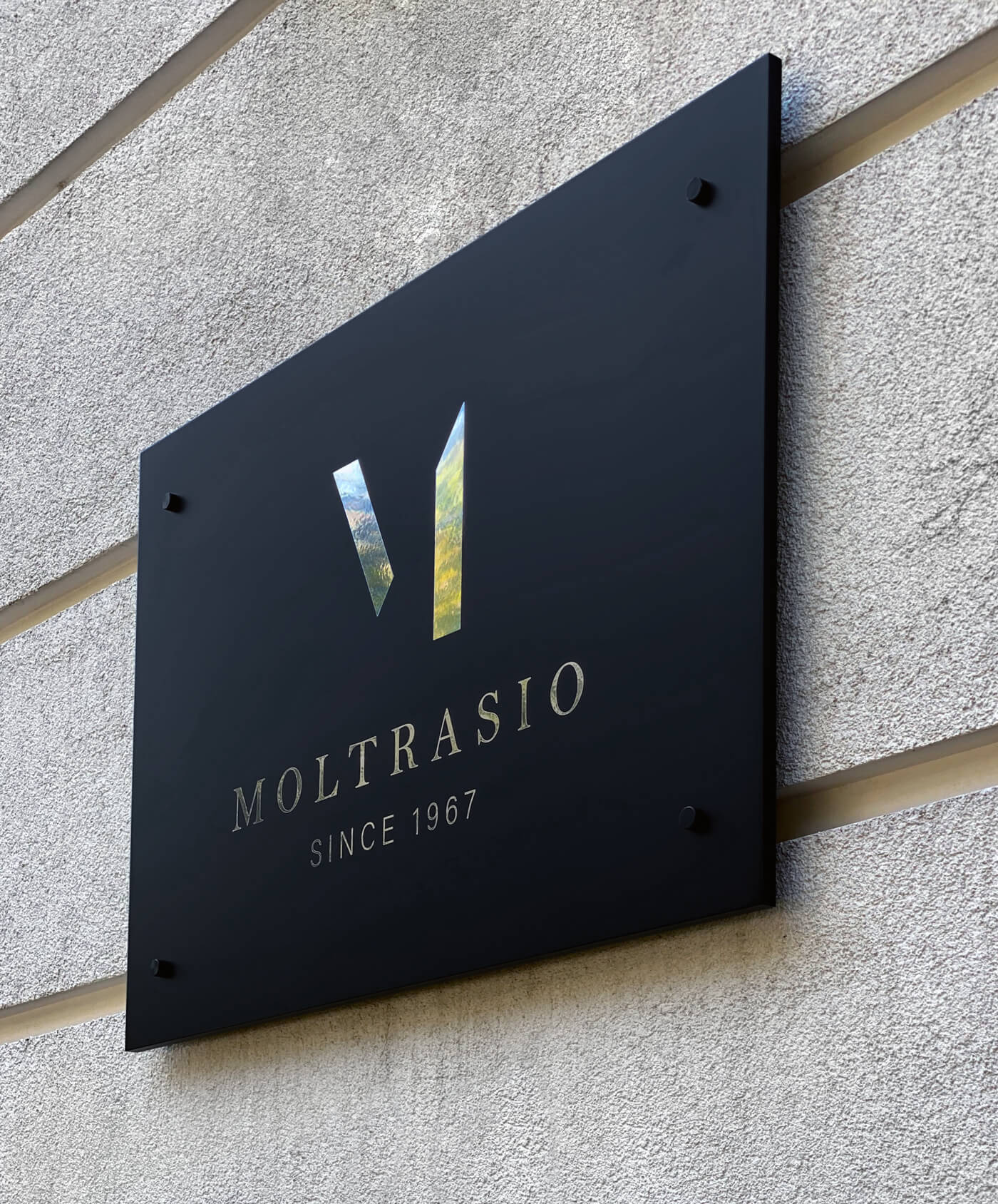
The concept of the new logo presents two blades fluctuating in space, in an apparently impromptu form that actually underlies their ideal intention: the blades come together to create an iconic shape, making the letter “M” visible while embodying a solemn yet future-forward touch, exuding elegance with a traditional take, stylishness and seriousness. The perfect combination of the values that make up Moltrasio’s DNA. Moltrasio, the essential is invisible to the eye.


